

After spending enough time on an interface, I start using it from memory. I know where every button is and what should happen next. That makes it easy to mistake my familiarity with it for ease of use.
Reviewing specific tasks helps me step outside that habit. On a portfolio, that might mean finding a project, understanding my work and reaching the contact page. In a journal, it might mean choosing an article, reading it and sharing it.
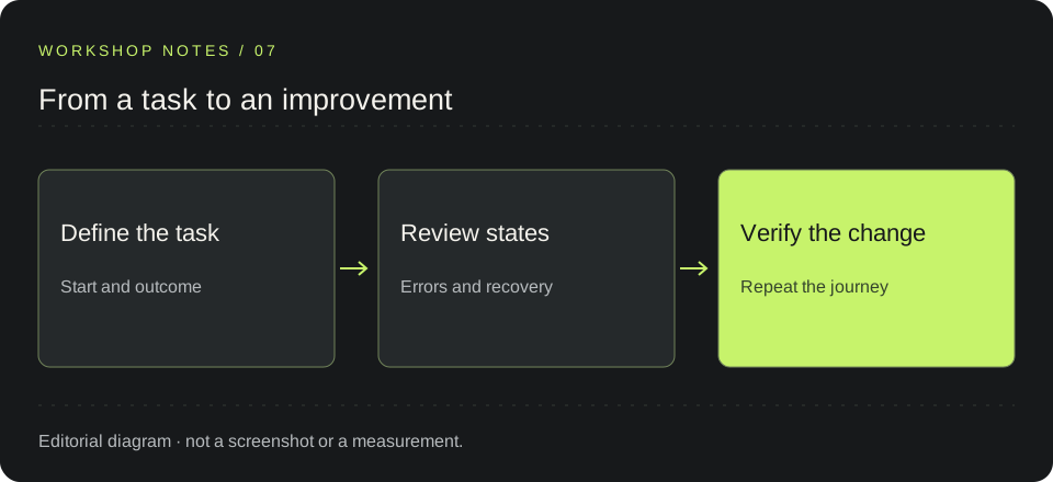
These are the strategies I would use as a starting point for a small review, including where AI can help me organize it. This is a working guide, not a report of user testing.
Start with a task and define its finish
“Review the site” is too broad. I prefer something like “open an article and copy its link.” It has a starting point, an action and an outcome I can check.
For that journey, I note what someone needs to find, what feedback they should receive and how they can continue if something fails. This turns the review into observable behavior.
Pressing a share icon does not finish the task by itself. A copied link needs confirmation. If the browser blocks copying, there needs to be another way to retrieve the URL.
Make interface states visible
A request can be pending, return no results or fail. If these states look the same, someone using the page has to guess what happened.
In code, it helps to model them explicitly. A state such as idle | loading | success | empty | error can be clearer than several booleans that allow contradictory combinations. Not every interaction needs all five: the model should reflect what actually happens.
I then review what each state displays. An error should explain what failed and offer a useful next action, such as retrying. An asynchronous confirmation can use a role="status" region without unexpectedly moving focus. That feedback still needs a manual check.
Reduce what people have to remember
Consistent navigation, clear labels and an active section help people stay oriented. These details seem small until they disappear and someone has to reconstruct the journey from memory.
In the journal, an active table of contents can show which section I am reading. In a listing, retaining filters when returning from a detail page avoids having to set them again. The second case is a design example, not a claim about a feature already in my portfolio.
I use Nielsen’s usability heuristics as a reference, especially visibility of system status, consistency and recognition rather than recall. They help me ask specific questions about a screen.
Design the way back and the failure too
Opening a modal is only part of the journey. I also check how to close it, where focus goes afterwards and whether I can continue where I left off. A cancel button should have a predictable effect.
For forms, a useful review involves causing an error: submitting an empty field or an incorrect format. I want an explanation near the field, the information I already entered to remain available and a clear way to correct it. These are cases to test, not measured results from this site.
I start with problems that block the task, then address those that cause uncertainty or extra effort. A visual adjustment can wait if an action cannot be completed.
Give AI a review with clear boundaries
A UI or accessibility review skill can help here. A skill provides instructions and criteria to guide the assistant; its actual scope depends on the tools and information it can access.
I would give it a specific task, route and context. For example:
Review the journey for opening an article and copying its link on mobile and desktop. For each potential issue, identify the step, observable evidence, who it affects and a small correction. Separate verified findings from hypotheses. If you can only read the code, say so.
With that brief, I can ask it to organize findings or suggest test cases. When it identifies a problem, I need to reproduce it. Reading code can suggest a risk, but it does not amount to observing the interaction in a browser.
Combine tools and repeat the journey
Lighthouse generates reports covering areas such as performance and accessibility. axe DevTools helps detect accessibility issues and guide their review. I treat their results as technical clues; a score alone does not describe how easy a task is to complete.
For a first pass, I would choose one journey, run the available checks and repeat it manually on a narrow screen and with a keyboard. I would then record each finding with its route, steps, expected result and observed result.
AI can help me organize those notes and draft a correction. The final check is still to return to the same journey and see what changed. To learn how someone else understands it, the next step is to observe someone trying to complete the task.
AN IDEA TO SHARE