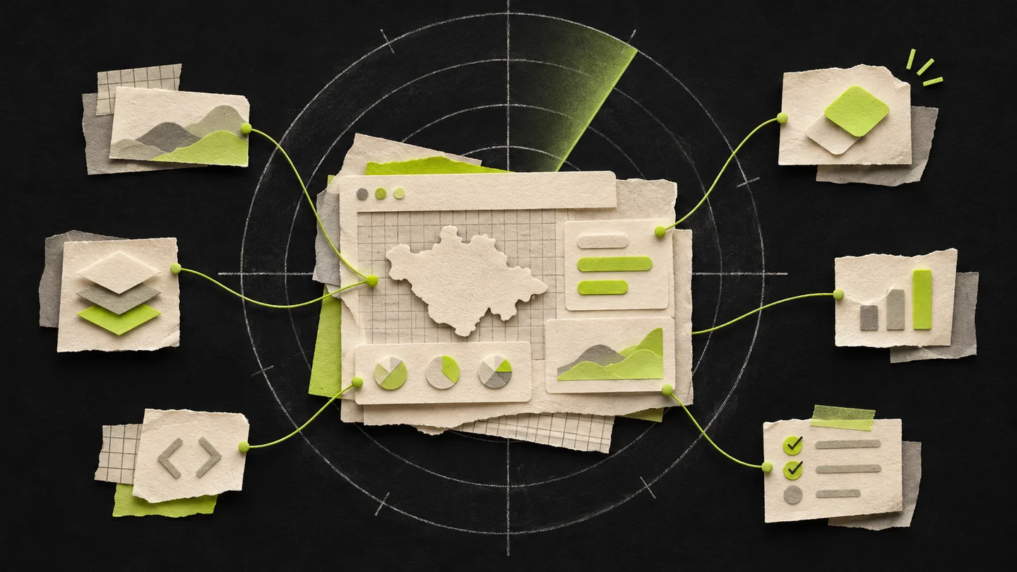
My old portfolio was starting to feel too simple. I wanted something more professional and engaging that reflected how much I had grown over the past few years. I also wanted people to get a better sense of who I am, beyond the projects.
The difficult part was turning that into a page. Saying “I want it to look better” is enough to start a conversation, but it does not help much when it is time to decide what to show, what to move and what to leave alone.
This is the first entry about that process. I want to use the journal to talk about the decisions that usually stay behind a screenshot: the adjustments, the doubts and the things that seemed like good ideas until I saw them working.
Giving the projects more room
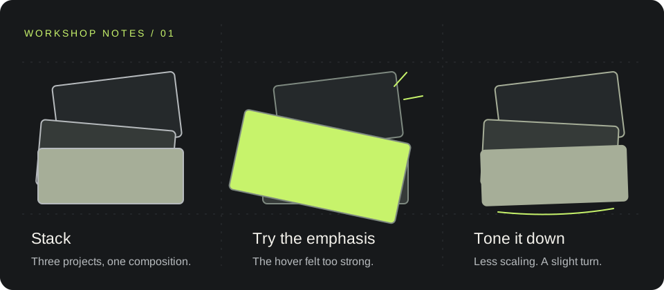
I started with the homepage. I wanted the work to have more presence from the first glance, so the hero ended up with three overlapping images: TARS, Radar Tlaxcala and HORRORVERSE.
Putting them together exposed a specific problem: each project has its own palette. The screenshots caught the eye, but they also competed with the rest of the site. I gave them a color treatment closer to the background and the portfolio’s green accent.
The project cards reveal their original colors on hover. In the hero, I chose to keep the filter. There is already depth and motion there; bringing back all the colors as well made too many things happen at once.
It was one of those adjustments that seems small until I compare the whole page.
The hover effect I had to tone down
I wanted the image under the cursor to stand out a little from the others. The first response felt abrupt: it grew too much and overlapped in a way I did not quite like.
I adjusted it again. Less scaling, a slight rotation and a quieter movement. Then I added a little more rotation, while keeping it subtle.
That says a lot about how the design took shape. Some decisions came from trying something, seeing it in context and saying, “Yes, but dial it back a little.”
Why the new version uses Astro
The site was going to grow on the inside too. Alongside project pages, I wanted to start writing here. That changed what I needed from the foundation.
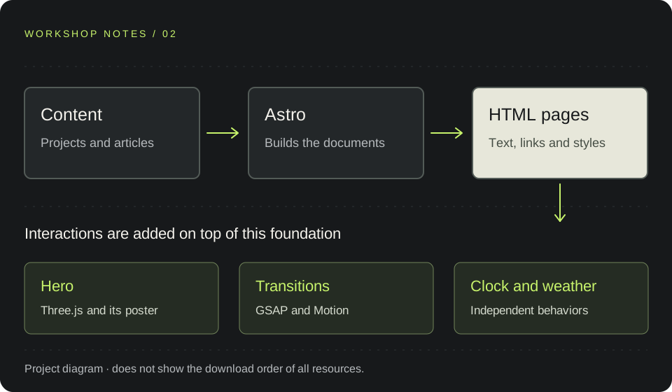
In this version, Astro generates the pages and articles as HTML when the site is built. The title, text and links are already in the document the browser receives. Interactions are added where they are needed.
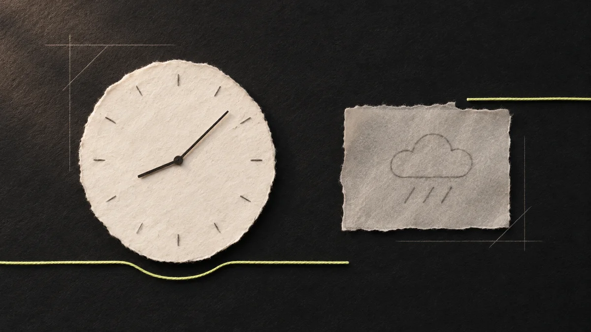
I liked that separation for this project. A project page or an article has plenty to read and a fairly clear structure. The hero, clock and weather have different needs; I can handle them without making the whole page depend on them.
The previous portfolio was built with Angular. I kept it in a separate folder and prepared its place at /anterior/, with a link in the footer. I want to be able to return to that version and see where this one came from.
I have not compared the performance of both sites under the same conditions. I chose Astro for what I wanted to build now; that comparison is still pending.
Details I wanted to keep
The redesign still needed a clock, weather, language switching and light and dark modes. They were already part of the portfolio, and I wanted to give them a place in the new design.
The clock gained seconds. The weather returned to the middle of the bottom strip, with the map on the right, highlighting Mexico and marking Mexico City. That point represents the clock’s time zone; it does not show the visitor’s location.
I also needed to tidy up navigation. On desktop, showing the navigation links and a hamburger menu was redundant. I kept the links visible and reserved the compact menu for smaller screens. I added Contact on desktop and a homepage shortcut called Orbit.
These details are easy to overlook in a design image. They become much more noticeable when moving around the site.
Opening up this space
The journal is one of the parts that makes the redesign worthwhile to me. A project page can show the result, but leaves little room to explain how I got there.
Here I want to take time over a decision: why I toned down an animation, how I organized an interface or what I changed after trying it. There will be code when it helps explain something, images when a detail needs to be seen and diagrams when drawing makes things clearer.
I chose the portfolio itself to start because the process is still close at hand. There are things left to review and measure. I would rather write about them as I work through them, with examples people can see.
The next entry will cover the hero’s motion and how I split the work between Three.js, GSAP and Motion. That hover adjustment has more to it than I can fit here.
In the meantime, you can browse the projects or visit About me. That is what I wanted when I started this redesign: more room to get to know my work and the person behind it.
AN IDEA TO SHARE